Table of contents:
Successful mobile app development involves several stages. Sarah, the lead designer at a food delivery startup, experienced this firsthand. After skipping the wireframing phase to save time, her team spent three extra months redesigning their app’s user flow when user testing revealed major navigation issues.
One of the important stages of successful mobile app development is wireframing. Though a simple operation, it plays a major role in setting the basics. However, people often overlook its significance, especially when compared to more elaborate mockups and prototypes.
As we proceed, we’ll explore why veteran mobile app developers trust this procedure. We’ll discover how it assists engineers in creating innovative solutions. You’ll also understand how it works and its development processes.
What is Wireframing?
Imagine you’re building a house. You wouldn’t start by picking out curtains or paint colors; you’d start with a blueprint. Similarly, a wireframe is the most low-fidelity digital illustration of the user interface (UI) of an application.
Take Tom’s fitness tracking app development journey, for instance. His initial idea was to create “just another workout app,” but through wireframing, he discovered that users needed clear visual progress indicators on every screen. This fundamental insight shaped the entire user experience, leading to his app achieving a 4.8-star rating.
In essence, a wireframe represents the most basic digital representation of an application’s user interface (UI). It contains the simple layout of various components, such as screens and links between them. They usually focus on layout, effectiveness, and the user’s navigation of the app, disregarding elements such as colors, fonts, and art.
A wireframe design for a mobile app works like the blueprint of a proposed structure. The architect creates a detailed drawing of the plan, which includes details such as the walls, room dimensions, and windows. But you don’t see details like paint, roofing materials, or even furniture. That’s because the blueprint only displays the foundation in which these later features will enter.
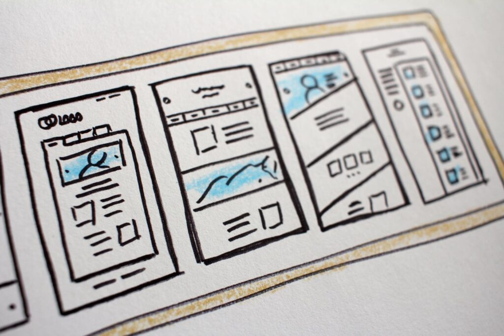
Mobile app wireframes range between simple pencil sketches and a detailed computer-aided design. The emphasis here is to illustrate the important features of the application, such as buttons, icons, menu bars, and content zones. It ensures the app’s interface is emphatic enough. It also permits flexibility, creativity, and functionality. This is essential as it prevents major inconveniences in the long run.
Main Aspects of Wireframing
If you’re not familiar with building blueprints, you may get confused at first glance. Most of them display the structure as floor plans, using shapes and lines to express features. You may still get a description of these symbols at the corner for better understanding. But the objective is to represent the building’s core features so you have a clear idea of their arrangement.
Like a building’s blueprint, a wireframe mobile app design uses different features to describe the concept. Consider how Netflix’s mobile app evolved: their wireframes revealed that users needed a “Continue Watching” section prominently displayed, leading to an increase in user engagement.
Each aspect showcases a different portion of the main idea and explains its relevance. Most sketches express the proposed idea using four main sections. They include:
Layout and Structure
When designing a banking app, developers discovered through wireframing that users expected to see their balance at the top of every screen, not just the home page. The layout and structure indicate the arrangement of the app’s components in the wireframe. It includes features like buttons, images, and text in subsections.
Navigation
This indicates the interconnectivity of various screens. Also shown is how the app user will switch screens. Instagram’s original wireframes showed that users preferred a bottom navigation bar over a hamburger menu, leading to their iconic five-button layout.
Functionality
This explains important app components and their functions. For instance, a mobile app wireframe may include text boxes explaining a search bar. A food delivery app’s wireframe testing revealed that users wanted to reorder previous meals with just one tap, leading to the creation of the “Quick Reorder” feature.
User Interaction
This illustrates how users execute specific actions within the app. Examples include shake, swipe, tap, etc. TikTok’s early wireframes emphasized vertical swipes over horizontal scrolling, revolutionizing social media navigation patterns.
Why Wireframing is Crucial in Mobile Application Development
There are many benefits to wireframing, which is why it is an integral stage of the mobile application development process. It is the middle ground between the program’s idea and the design and development stages.
Implementation of the App’s Journey in Steps
Consider the story of a ridesharing startup that skipped proper wireframing. Six months into development, they realized their driver-passenger matching screen was too complicated, requiring a complete redesign that cost them $200,000.
Even before development, stakeholders should have an idea of how the app will look and work. A wireframe design for a mobile app provides a basic visual structure for understanding its progress. This is crucial for developers and designers to stay on one page.
Through their interactive sketches, you get a view of the app’s navigation. This also helps you decide how to best optimize the functions. You can also establish features early so the workload isn’t pointless.
Improving Team Collaboration
When developing their mobile banking app, a design team used wireframes to demonstrate complex security features to their development team. This visual communication helped bridge the gap between security requirements and user experience needs.
A major issue in mobile app development is a lack of communication. While developers are working on one idea, stakeholders may come up with another. This disconnection often influences the development process.
Wireframes allow developers and stakeholders to communicate their differences. It lets them share their thoughts about the application. These could include insights into how customers use the application—even before the actual development process begins. Plus, its simple, changeable designs allow faster modifications.
Minimizing the Cost and the Duration
One of the key advantages of wireframing is the ability to save time and resources. Its changes are less expensive than fixing issues in the finished work. Because of its basic form, developers can spell out the app’s usability early on.
Its high content curation capacity also indicates efficient operation. Its flexibility allows for the stretching and constriction of ideas at will. Its flexible nature balances with lesser financial restraints, leading to better productivity.
The Wireframing Process
Each stage of the wireframing process aims to improve the layout and performance of an app.
Step 1: Research and Define Requirements
When Spotify developed their car mode interface, their research phase revealed that more users needed larger buttons and voice control options while driving. This insight fundamentally shaped their wireframe approach.
Most designers will say that the wireframing process begins with the design, which is not the case. Obtain relevant information about the app to design prior to the designing phase.
For instance, it should address the demographics of users and create personas that are tailored to their needs. You also need to grasp the main features expected and the needs of the users. Finally, state the purpose of the app and which users will benefit from it.
Step 2: Sketch an Initial Mobile App Wireframe
You should also create sketches of the main screens of the application you are currently developing. Mobile app wireframes come in three forms, based on their complexity:
- Low-Fidelity: As the name suggests, these wireframes are very basic drawings, either drawn on paper or using software, which do not have any design incorporation, but rather only the layout and the flow of the page are mapped. They are less time-consuming and simple to alter. WhatsApp’s initial chat interface began as simple boxes and lines.
- Mid-Fidelity: Twitter’s tweet composition screen evolved from basic layouts to include placeholder icons. These now include additional elements such as text, icons, and even picture placeholders. They give an abstract representation of what the application in question will look like. But a mid-fidelity wireframe refrains from fleshing design details such as colors and fonts.
- High-Fidelity: High-fidelity designs include more detailed representations that closely resemble the final product. These may feature well-designed icons, well-defined sizes, and even use real textures. Investors typically introduce apps with high-fidelity wireframes for their review and approval.
The main focus should be the application’s purpose and how users will use it. Create an easily rendered wireframe mobile app design. This ensures making future changes will not require much effort.
Step 3: Designing of the Wireframes in Digital Form
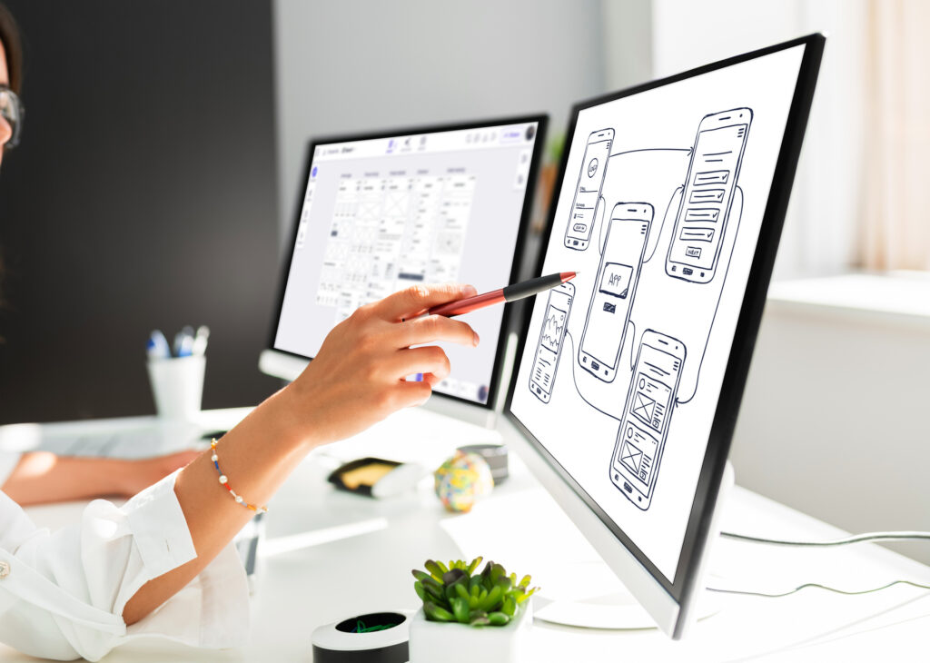
Transition from sketching to creating a mobile app wireframe using software. At this stage, one is able to beautify the arrangement and add more elements to the structure. Each individual employs a unique methodology for this purpose. Therefore, the style of a business analyst will differ from that of a software designer.
This is where your software choice comes into play. It’s best to choose an option that’s popular with your niche. This will let you explore ready-made templates that appeal to your design.
Step 4: Testing and Feedback
Present the wireframe to your team or clients to gather their feedback. Such processes are quite useful in identifying problems and possible improvements regarding the user interface. It is important to make changes to the wireframes according to their comments before moving to the next phase.
You may also include your users in the wireframing process. Though not a popular process, many brands enjoy rich feedback from this technique. Plus, it helps them establish essential features long before prototyping.
How We Can Help
North South Tech transforms your mobile app ideas into reality through meticulous wireframing. We’ve seen how skipping this crucial step leads to costly revisions and frustrated teams—that’s why wireframing sits at the heart of our development process. Before writing a single line of code, our developers meticulously map out every screen, interaction, and user flow.
This strategic approach has helped our clients dodge the common pitfalls of rushed development, like the three-month redesign delays mentioned in the article. When you work with us, you’ll see your app’s blueprint come to life, complete with navigation paths, functionality markers, and user interaction points. Send us a message, and let’s begin crafting your app’s success story.


